SYRIZA PROGRESSIVE ALLIANCE GRAPHICS, VIDEO

SYRIZA

PROJECT REBRANDING

YEAR 2020

FORMAT GRAPHICS, VIDEO

SYRIZA

PROJECT REBRANDING

YEAR 2020

FORMAT GRAPHICS

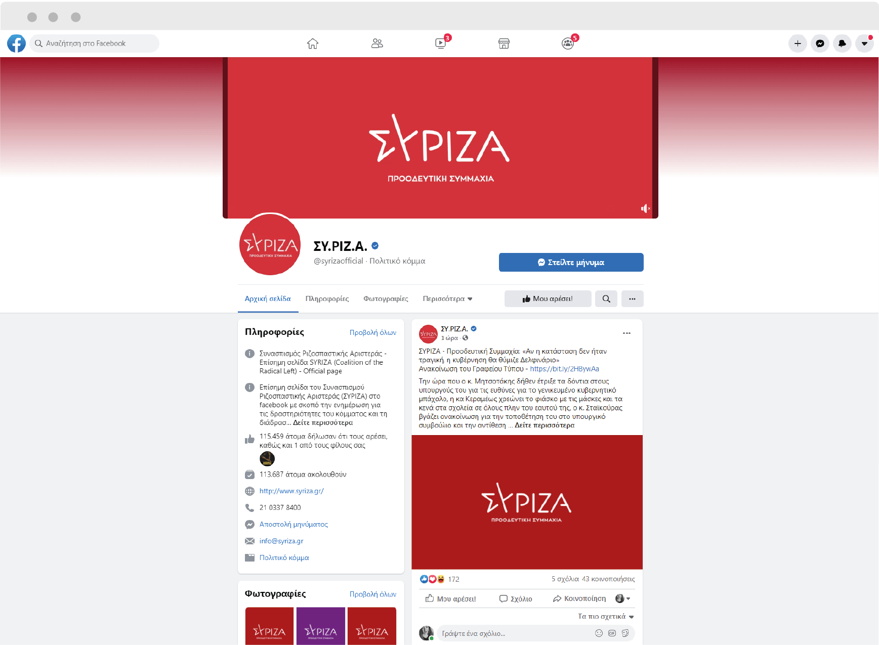
We were asked to redesign the new visual identity of SYRIZA PROGRESSIVE ALLIANCE alongside with the launch campaign.

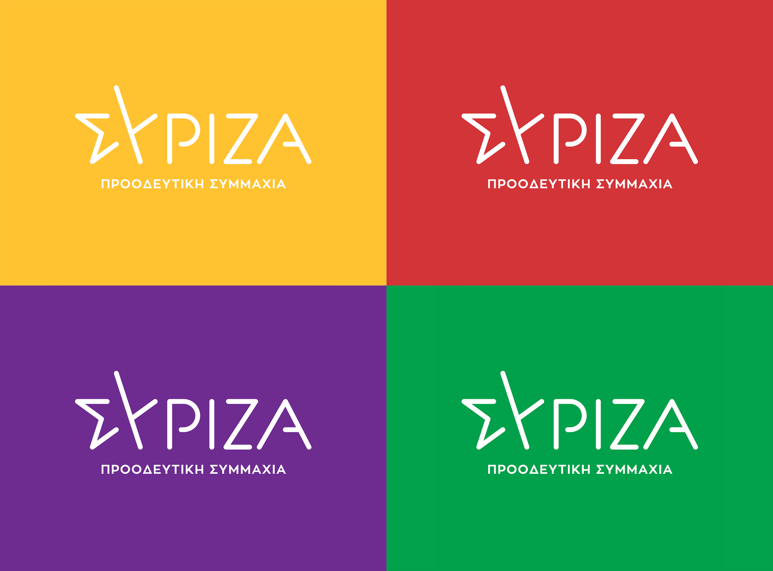
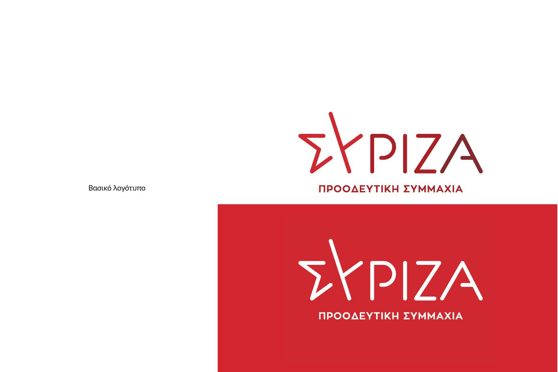
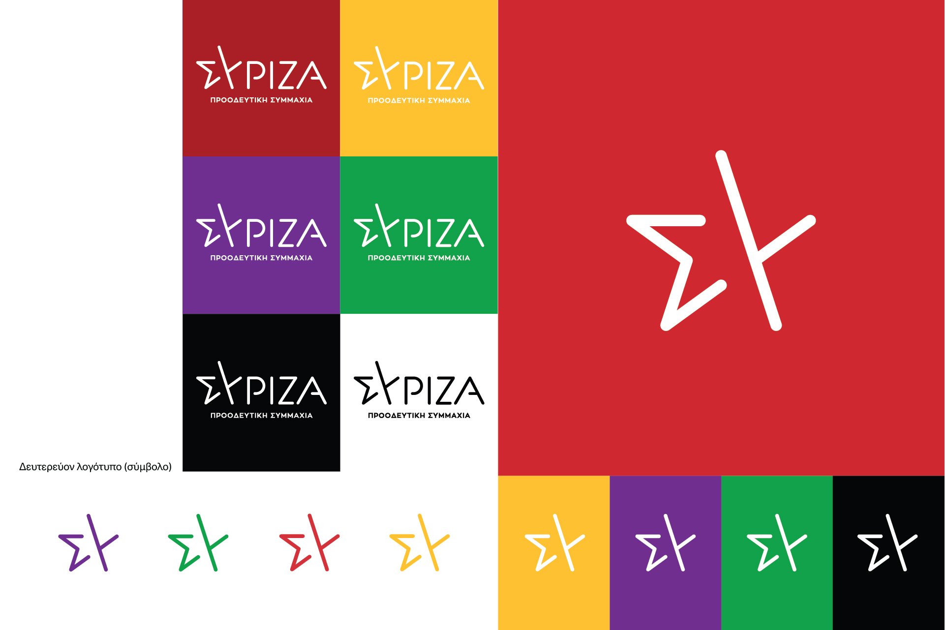
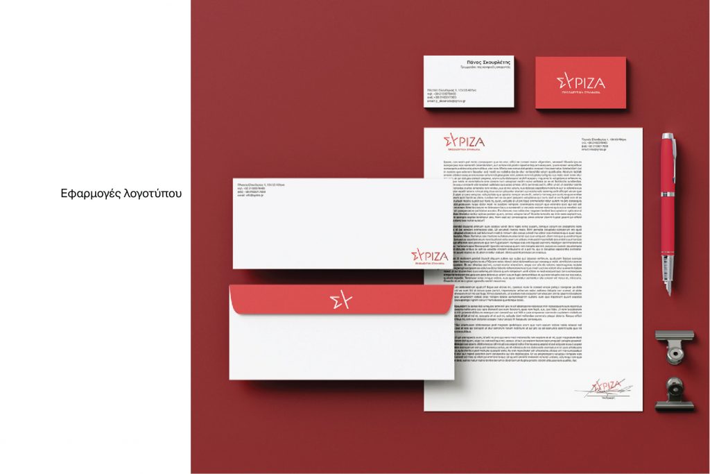
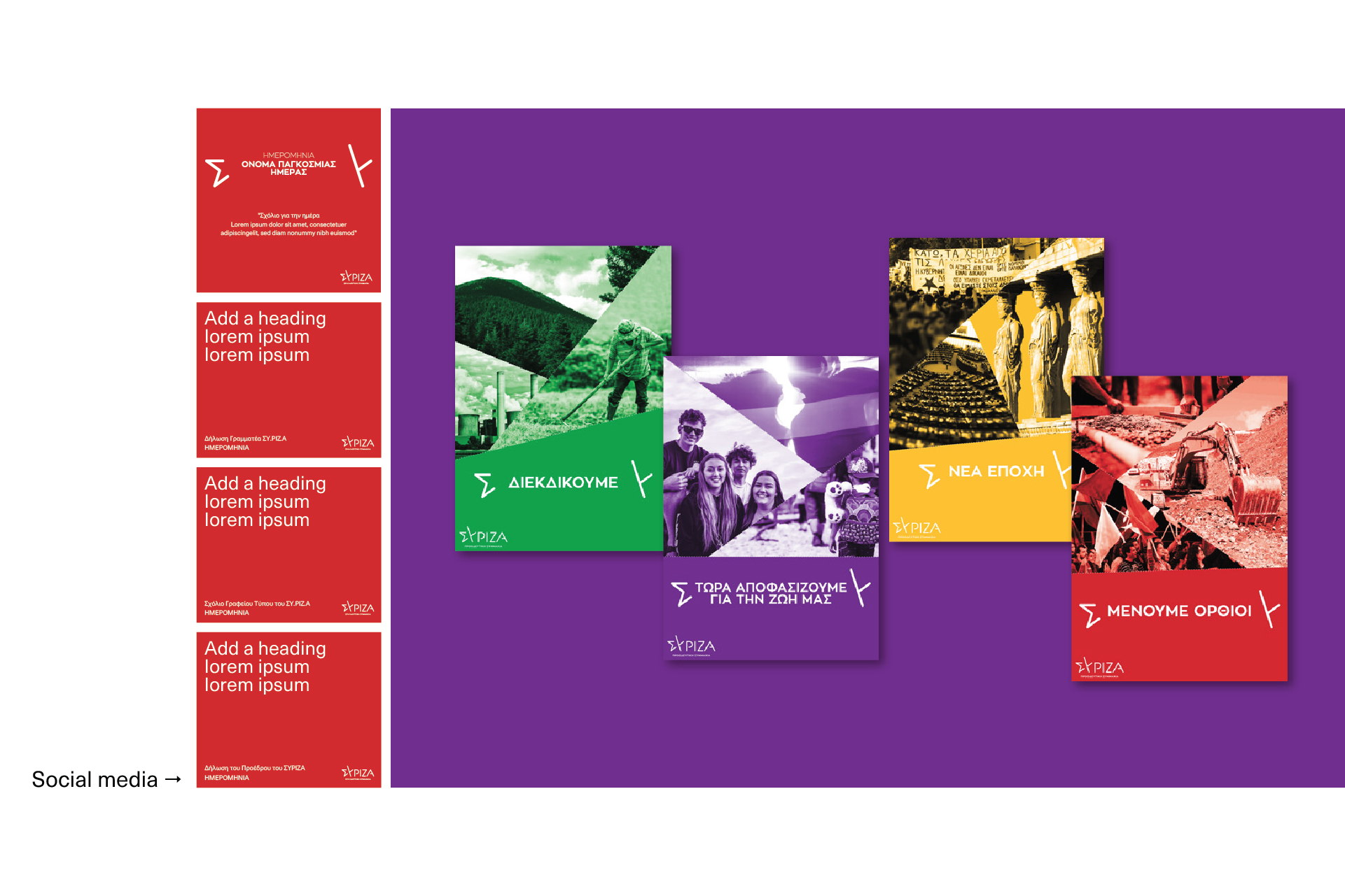
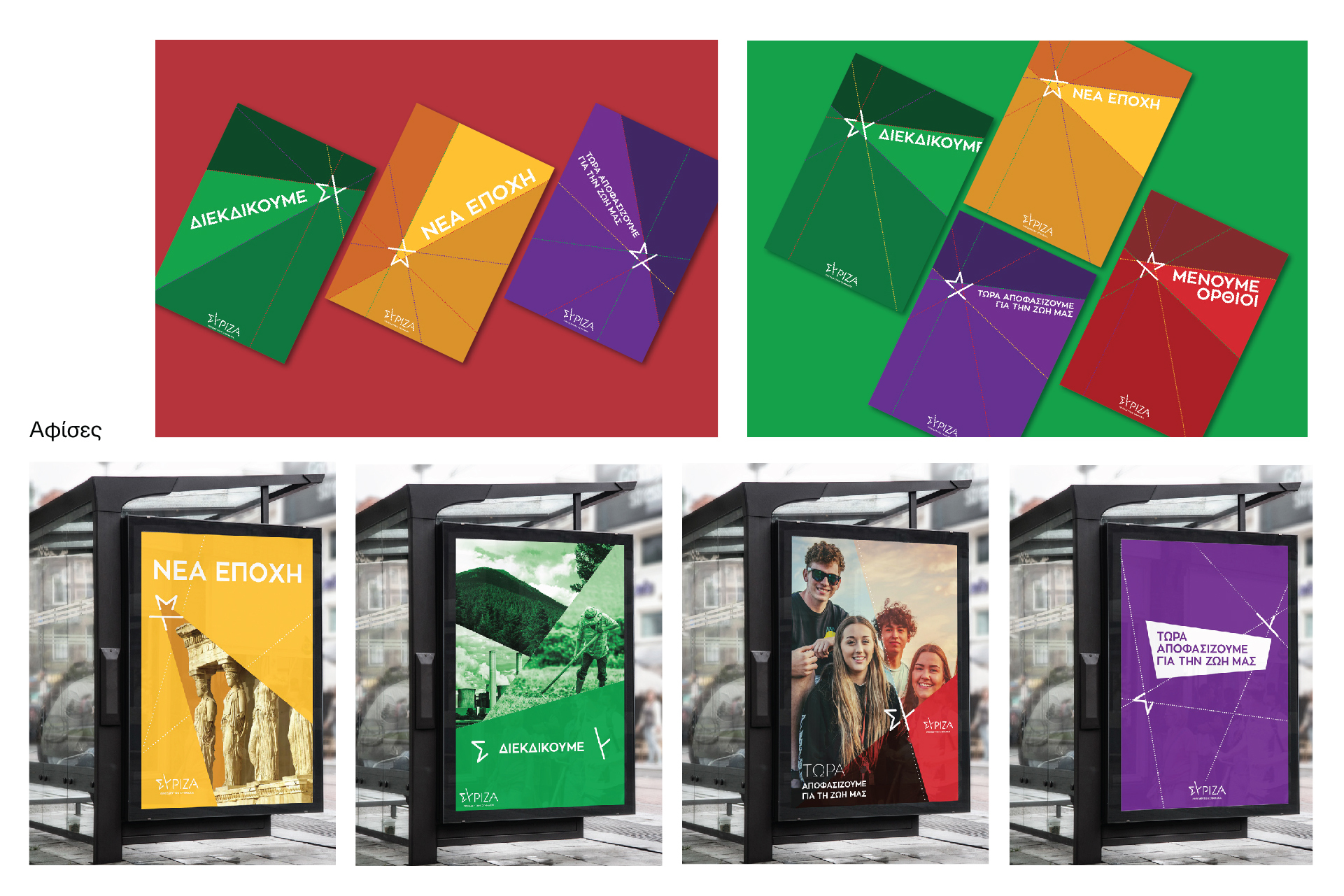
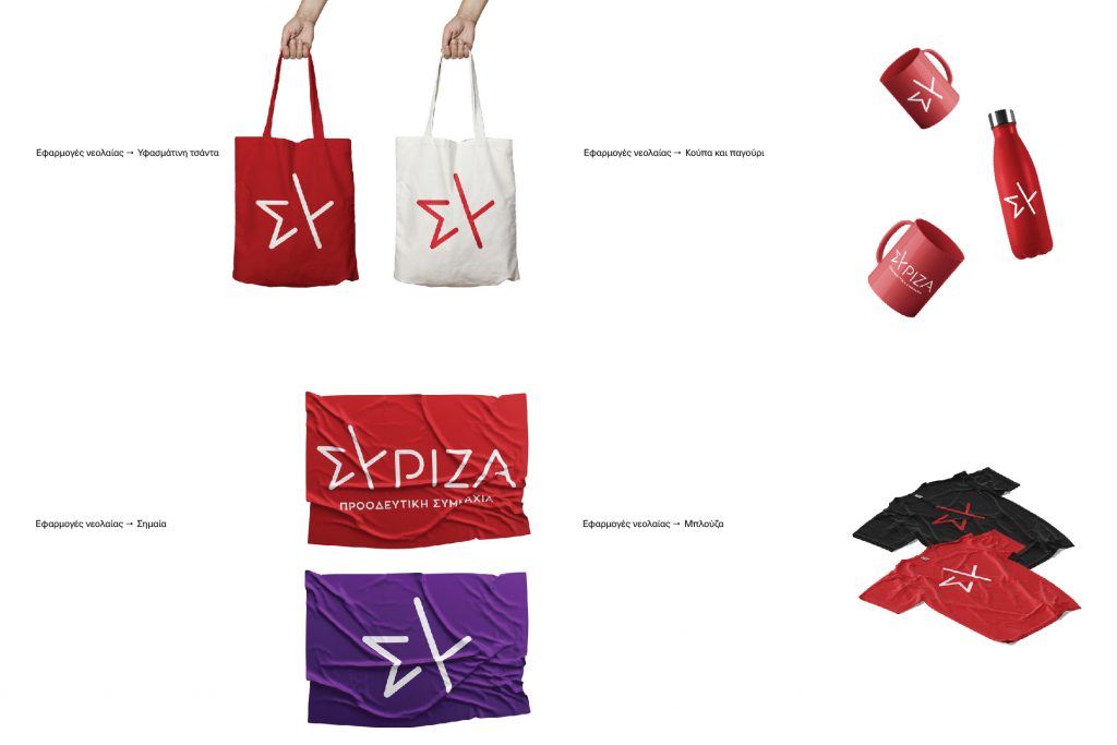
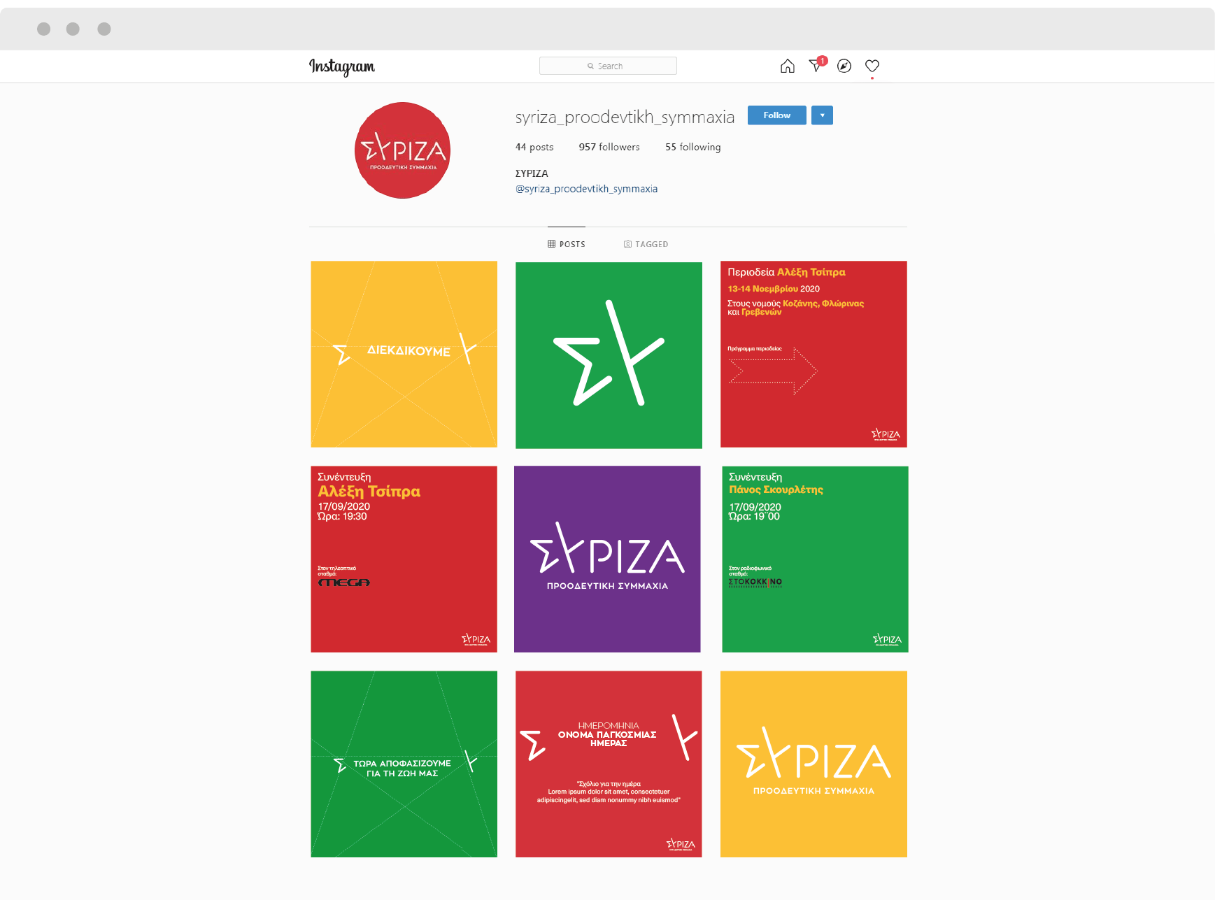
The concept behind the logo, main element of the corporate identity, is a star formed by the first two letters of SYRIZA, “S” and “Y” which are colored in three different shades of red. The star was chosen as it represents an eternal guide, the compass that helps us find our way. Regarding the corporate identity, we chose a color palette consisting of four colors, red, green, purple and yellow. The idea was to connect 4 universal values with each one of these colors: Democracy is represented by the red color, Justice by yellow, Equality by purple and Solidarity by green.

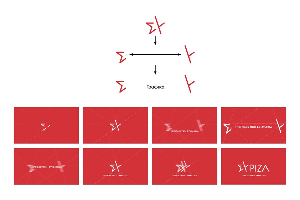
The new identity made its deput through a 5-minute video presented by SYRIZA’ s president Alexis Tsipras. The graphics that we designed especially for the video are dominated by the star and its projections on the axes created by its 5 peaks through the structure and deconstruction of the star.

Utilizing the concept of the star and its peaks and using simple and clean elements, we have designed some of SYRIZA’s recent campaigns (Public Health Reform Programme and “Become a member” in 2021).

The Coalition of the Radical Left – Progressive Alliance (SY.RIZ.A – Progressive Alliance) is a Greek, left wing, political party. It was founded in March 2004 as an electoral alliance of left-wing parties and organizations, the largest component of which was the Coalition, while in June of 2012, it was re-established as a single political party. President of SYRIZA is Alexis Tsipras. We were asked to redesign the new image of the party and create the graphics in the presentation video, by its president, Alexis Tsipas.. Also, we were asked to design the launch campaign of the new image and to build the new website of the party. In the logo that we designed, the star of the “fights”, formed by the first two letters of the name of the party, “S” and “Y”, are colored in three different shades of red. Stars are the symbols that help us find our way, eternal guides and compass of travelers, a symbol recognized globally… Regarding the corporate identity, we decided on a color palette consisting of four colors: red, green, purple and yellow. With the idea of connecting a certain value with each one of these colors. Democracy represented by the red color, Justice by Yellow, Equality by Purple and Solidarity by Green. For the launch of the logo, we created 5 teasers with the aim of showing one every day, until the day of the presentation. In each teaser, one of the 4 colors of our new color palette, is used as a background (red, green, yellow, purple). In the teasers, we can see the star but without revealing that it is actually the new logo of the party. Each one of the teasers is revealing and communicating to the spectators, through the construction and deconstruction of the star a specific value, and books an appointment with them on the date of its presentation. At the presentation spot, the President of SYRIZA revealed the new logo of the party through a short 5 minute video. The graphics we designed are dominated by the star and its projections on the axes created by its 5 peaks. The visual representation of the spot uses the structure and deconstruction of the star to communicate the messages, that each time need to be communicated. We have built the party’s new site to be user-friendly and mobile responsive thus achieving easy navigation and usability. All based on the new image of the party.